From the early days of static web pages and awkward interfaces, the field of web design has advanced significantly. Because of the quick development of technology and the widespread usage of mobile devices, web design has changed to accommodate the wide range of user demands on multiple platforms. Web designers are increasingly aiming to build websites and apps that not only look fantastic but also provide the best user experience across various devices as a result of the rise of smartphones and tablets.
Recognizing that customers increasingly access material from a variety of platforms, including PCs, smartphones, and tablets, is crucial for game developers and programmers. Multiple-device designs are now a must, not a luxury. Failure to support various devices might turn off prospective customers, which would decrease engagement, reduce traffic, and eventually result in lost sales. The secret to luring and keeping consumers is to provide a smooth and engaging user experience, and you can only accomplish so by using a design strategy that takes into consideration the numerous devices that people will use to access your content.
Three main design philosophies have arisen in response to the increasing need for cross-platform compatibility: mobile-first, responsive design, and adaptive design. Each of these approaches has its own advantages and disadvantages that are tailored to the needs and objectives of a particular project. Understanding the variations between different design strategies and selecting the one that most closely reflects the goals of your project can help you build an interesting and user-friendly website or application. We will examine the nuances of mobile-first, responsive, and adaptive design in this article, offering helpful insights to assist you in making a well-informed choice for your next game development or programming project.
Mobile First Design
A design strategy known as “Mobile First Design” gives the requirements and limitations of mobile devices top priority right from the start of the development cycle. Mobile First Design encourages designers and developers to build websites and apps with just the most essential features and information, creating a smooth experience for mobile users by concentrating on smaller displays and constrained resources. More features and aspects may be added as the design is progressively scaled up to fit bigger displays, but the main emphasis is still on providing the best experience possible for mobile users.
Advantages:
1. Specify the most important components and features. By using a mobile-first design strategy, you can make sure that your website or application is constructed using solid principles. You may remove extraneous clutter and distractions and provide your audience a clear, effective, and user-friendly experience by focusing on the most important features and information. For programmers and game designers, this simplified approach may be very helpful since it allows you to keep a sharp focus on gameplay and user interaction.
2. Enhanced efficiency. You are inevitably dealing with constrained resources when you build for mobile devices first, such as smaller displays, slower internet connections, and less potent technology. This restriction promotes efficiency and optimization, resulting in quicker load times and improved overall performance. Users will value the quick, responsive service, which might lead to increased rates of engagement and retention.
3. Heightened interest among users. When you give mobile users priority, you’re serving a large and quickly expanding clientele. By ensuring that your website or application is usable and pleasant for this audience, you may boost user engagement and happiness. This practice is known as “mobile-first design.” Getting mobile consumers’ attention as a game developer or programmer may have a big influence on the success of your project.
Disadvantages:
1. Fewer features on bigger displays. Although a mobile-first approach might result in a more efficient user experience, it may also restrict functionality for users of devices with bigger displays, including desktops or laptops. Some desktop users may find the experience inadequate or unsatisfactory due to the emphasis on core functionality and information, especially if they were hoping for a richer, more immersive experience.
2. Possibility of a less realistic desktop experience. It’s possible that Mobile First Design may lead to a less compelling desktop experience since it puts such a heavy focus on efficiency and simplicity. Game designers and programmers should carefully evaluate the expectations of their target audience and strike a balance between mobile optimization and offering users on bigger screens an engaging, immersive experience.
Responsive Design
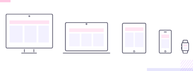
A single, flexible website or application layout that functions across a variety of screen sizes and devices is the aim of responsive design. By utilizing fluid grids, adaptable images, and CSS media queries, responsive design ensures that your content appears fantastic and functions flawlessly whether it is accessible on a desktop, laptop, tablet, or smartphone. The core principle of responsive design is to make your content usable and enjoyable for all users, regardless of the device they’re using.
Advantages:
1. Many devices with the same codebase. The ability to support numerous devices with a single codebase is responsive design’s key benefit. You may keep a single, cohesive design that adjusts to multiple screen sizes rather than building distinct versions of your website or application for various devices. This method may save time and effort for programmers and game designers, which will ultimately reduce the overall cost.
2. Adaptive layout flexibility. Your layout will adjust elegantly to any screen size thanks to the responsive design’s fluid grids and adaptable pictures, providing a consistent and pleasurable user experience. The ability to build immersive, captivating experiences that look fantastic on every platform is especially helpful for game developers and programmers.
3. Easier updates and maintenance. Responsive Design streamlines maintenance and update procedures by using a single codebase. You may update a single codebase to ensure consistency across all devices rather than updating several versions of your website or application. For programmers and game designers, this simplified technique offers potential time and resource savings, making it a compelling choice.
A single, flexible website or application layout that functions across a variety of screen sizes and devices is the aim of responsive design. By utilizing fluid grids, adaptable images, and CSS media queries, responsive design ensures that your content appears fantastic and functions flawlessly whether it is accessible on a desktop, laptop, tablet, or smartphone. The core principle of responsive design is to make your content usable and enjoyable for all users, regardless of the device they’re using.
Disadvantages:
1. Mobile device load times that are longer. Longer loading speeds on mobile devices might be a disadvantage of responsive design. As all devices share the same codebase, mobile users can find up downloading files that are only required for displays with bigger resolutions. Performance may be affected, which may affect user pleasure and engagement.
2. Optimizing for certain devices is challenging. Despite the fact that responsive design makes sure your content appears excellent on all devices, it may not be as successful when it comes to device-specific optimization. A one-size-fits-all responsive design strategy might make it challenging for game developers and programmers to get finer control over the design and performance of specific devices that they may sometimes need.
Adaptive Design
By using a variety of fixed layouts, adaptive design is a method of web design that seeks to create experiences that are suited for certain devices. In contrast to Responsive Design, which identifies the user’s device and screen size and delivers the best layout for that particular device, Adaptive Design uses fluid grids and flexible pictures. This method enables programmers and game designers to build tailored experiences for various devices, assuring the best usability and design for every user.
Advantages:
1. Tailored interactions for certain gadgets. Delivering personalized experiences for different devices is one of the key advantages of adaptive design. Game developers and programmers may make sure that their website or application appears and functions optimally on each platform by generating various layouts for different screen sizes and devices. A user experience that is more engaging and immersive may result from this degree of customization.
2. Improved design and performance control. Game designers and programmers have more control over the look and feel of their work because of adaptive design. You can precisely adapt and optimize for each platform by designing unique layouts for various devices, giving your consumers the greatest experience possible. For game producers that must fine-tune gameplay components and user interactions, this degree of flexibility may be quite useful.
3. Possibility of enhancing user experience. By customizing your design for particular devices, the adaptive design could produce a better user experience. Users are more likely to interact with a website or application that is optimized for their device since it provides a better and more seamless experience. As a result, programmers and game developers can see an increase in customer satisfaction and retention.
Disadvantages:
1. Increased expenses for construction and upkeep. The more expensive development and maintenance expenses of adaptive design are one of its key disadvantages. Several layouts need to be made for various devices, which may take a lot of time and resources and raise costs. Managing several layouts may also be more difficult than doing so for a single codebase, as is the case with responsive design.
2. Increased implementation complexity. Since it necessitates the creation of numerous layouts and the identification of user devices, the adaptive design might be more difficult to execute than other design techniques. Some game designers and programmers may find this increased complexity difficult to handle, especially if they have no prior expertise with adaptive design or are under time and budget constraints.
Comparison: Mobile First vs. Responsive vs. Adaptive Design
Every design strategy has unique performance consequences. With its emphasis on important content and optimization, mobile-first design often provides quicker load times and improved overall performance. Although the responsive design may adjust to different screen sizes, because of its universally applicable codebase, it may result in slower loading speeds on mobile devices. With its customized layouts, adaptive design can offer improved performance for particular devices, but the requirement to maintain several layouts may have an influence on the speed of the entire site.
User encounter
The design strategy chosen will have a big impact on the user experience. Although providing a simplified, effective experience for mobile users, Mobile First Design may make desktop users feel underutilized. All devices receive the same experience thanks to responsive design, although it may not be as well-suited to particular devices as adaptive design. Personalized experiences that are catered to certain devices are made possible through adaptive design, which might increase user engagement and pleasure.
Costs of construction and upkeep
Due to their shared codebase, Mobile First Design and Responsive Design often have reduced development and maintenance expenses. While Responsive Design can be more resource-intensive during the original development phase, Mobile First Design may require more work to scale up the design for larger displays. On the other side, adaptive design frequently entails greater development and maintenance expenses since it requires the creation and upkeep of several layouts for various devices.
Adaptability and pliability
Responsive Design leads the way in adaptation and flexibility thanks to its fluid grids and adaptable pictures that guarantee a smooth experience on a variety of devices. Although mobile devices are the focus of the mobile-first design, they may not scale up as well to bigger screens. Although being optimized for certain devices, the adaptive design could have trouble supporting new devices or screen sizes without further development work.
Choosing the Right Approach for Your Project
Factors to think about:
1. Target market and their gadgets. While selecting a design strategy, it is essential to comprehend your target audience and the devices they use. Examine the demographics, browsing patterns, and preferred devices of your audience to ascertain which design approach would best meet their requirements and expectations.
2. Priorities and project objectives. While choosing a design strategy, take into account the objectives and priorities of your project. Mobile First Design can be the ideal option if your main goal is to provide users with a quick, optimized experience on their mobile devices. Responsive Design can be the best option if giving them a consistent experience across all devices is your top concern. Adaptive Design may be the best option for projects that need highly tailored user interfaces for particular devices.
3. Resources and the budget. The right design approach will be decided in large part by your budget and your available resources. While Adaptive Design may be more expensive owing to the requirement for different layouts, Mobile First and Responsive Design often have cheaper development and maintenance expenses. To make sure that the design plan you have chosen is workable and sustainable, evaluate your budget and available resources.

Provide examples to illustrate each strategy
1. Companies and websites with a content-focused approach to mobile. Startups and websites that value speed, simplicity, and the mobile user experience should consider the mobile-first design. Mobile First Design may assist new businesses in building a strong online presence and serving the fast-expanding mobile audience since it places an emphasis on key features and content.
2. Most websites and e-commerce are responsive. Since responsive design guarantees a uniform and smooth experience across all devices, it is appropriate for the majority of websites, including e-commerce platforms. It is a flexible and adaptable solution for a broad range of applications, including online businesses that need to serve customers using multiple devices because of its capacity to adjust to varied screen sizes and devices.
3. Complex web apps and upscale websites are adaptive. For sophisticated websites and complicated web apps that need a lot of customization and device-specific optimization, adaptive design is the ideal option. This design strategy is a great option for projects that require the highest level of design control and performance since it enables game developers and programmers to customize the user experience for certain devices.
Conclusion
The contrasts between the Mobile First, Responsive, and Adaptive Design methods have been discussed throughout this article. Although responsive design guarantees a uniform and adaptive experience across all platforms, the mobile-first design emphasizes mobile users by concentrating on vital information and features. On the other side, the adaptive design uses a variety of layouts to give customized and improved experiences for particular devices.
For game developers and programmers aiming to build immersive and engaging experiences for their customers, understanding the advantages and disadvantages of each design method is essential. You may choose the strategy that best matches your project’s objectives, target audience, and available resources by carefully weighing the advantages and disadvantages of Mobile First, Responsive, and Adaptive Design.
Are you prepared to put your concept into action? Give Eventyr a chance to assist you in developing an engaging and immersive experience that makes an impact on your users. We have the knowledge and tools to turn your idea into reality when you partner with our highly experienced professional team. Contact us right away to learn more out how Eventyr can take your project to new heights.